Power BI Introduction: Data Cleaning and Basic Charts using BOCSAR Data

This article will walk through how to build a column chart using Power BI Desktop and data from the NSW Bureau of Crime, Statistics and Research (BOCSAR). It will use custody statistics to build this column chart:
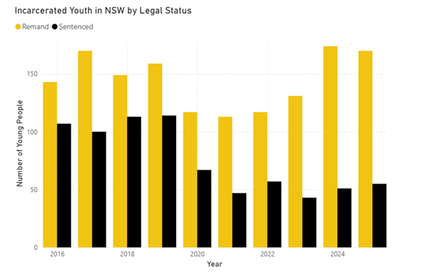
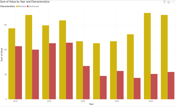
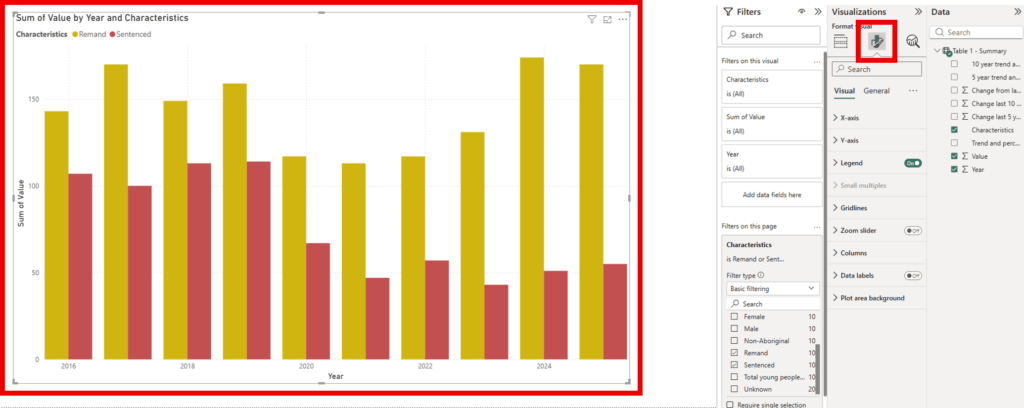
The chart visualises two data series – young people on remand, and youth sentenced to detention – over the years 2016 to 2025.
If you haven’t downloaded the software already, you can do so using this process: How to download Power BI
Data Cleaning
Data cleaning is the process of organising data before it is used for other inputs, like charts and graphs. This post will show you how to get your data ready for charting in Power BI.
Step 1 – download your data
Find your data source and download the file.
This example is using the BOCSAR Youth Custody Report, found here.
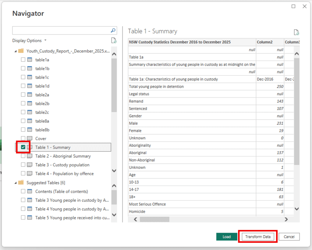
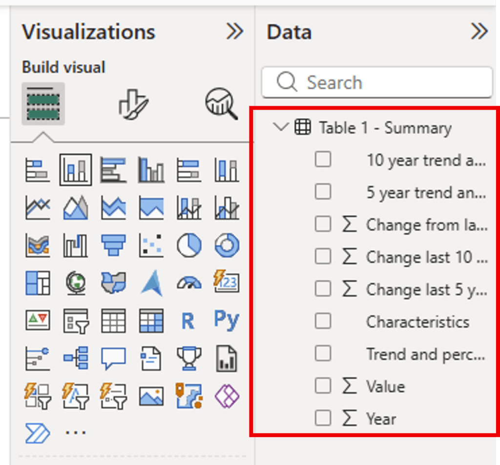
Download the Excel file (XLSX) and save it in the relevant folder on your computer. Open the file to review the contents, so you know what sheet you will be using before importing into Power BI. For this example, we will use Table 1 – Summary.
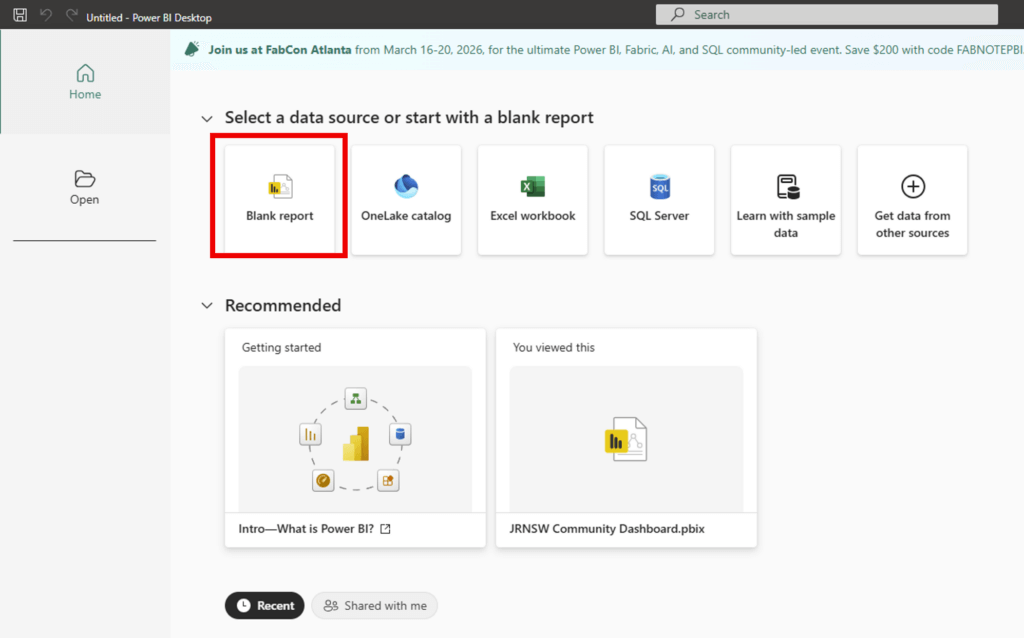
Step 2 – open Power BI Desktop
Open Power BI desktop and create a Blank report
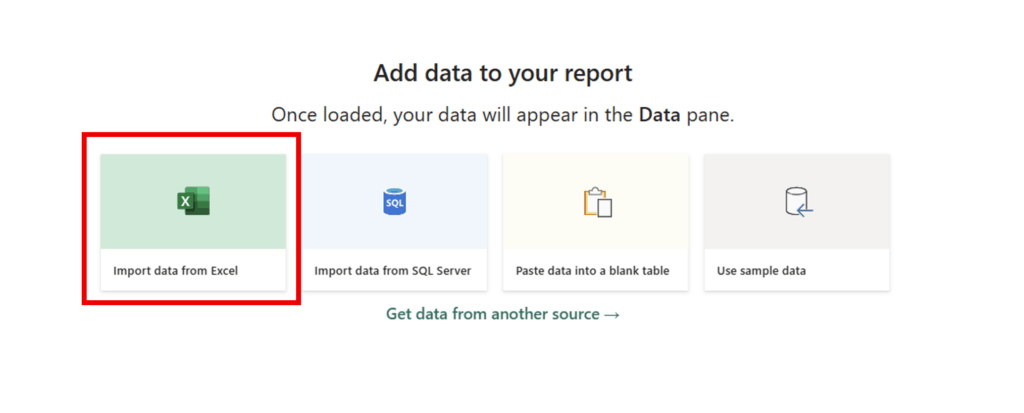
Step 3 – Import your data
Import your data file by selecting Import data from Excel and select the correct file in the pop-up window.
Once you have selected the file, a Navigator window will appear.
Select the sheets you want (select the box so it becomes ticked) and press Transform data. This will open the data in a new window.
Step 4 – Transform Data
This example will demonstrate how to make a column chart comparing remand and sentenced populations over time. We can remove most of the data as we only need the remand and sentenced figures, and the demographics.
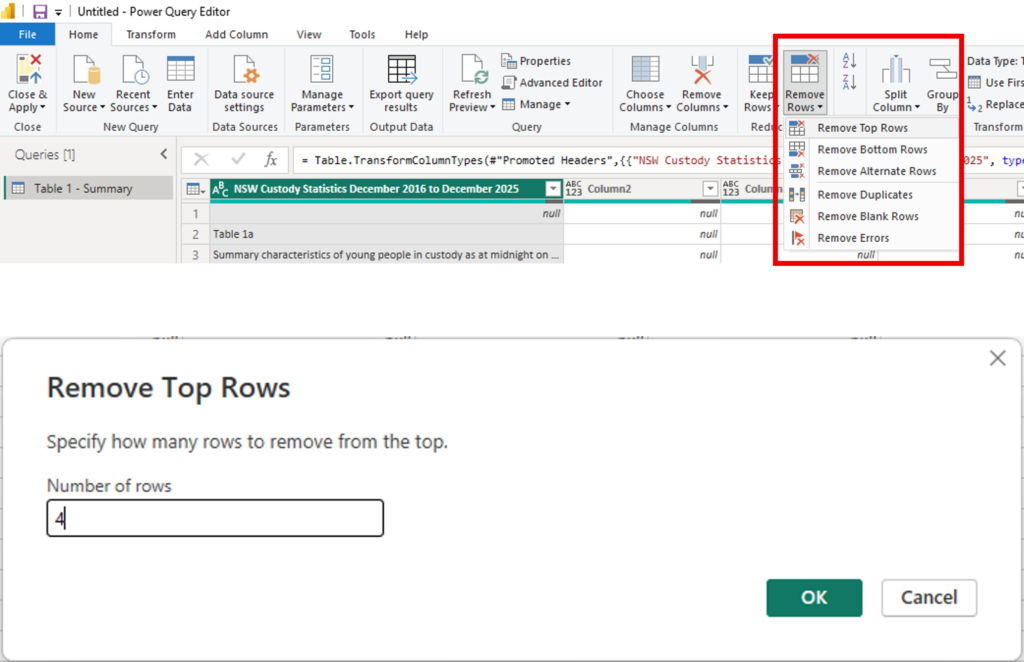
Firstly, we want to remove the top 4 rows as they are blank. Do this by clicking the Home tab > Remove Rows > Remove Top Rows > enter the required number (4 in this case).
Keep the rows that have the data for the chart: Home tab > Keep Rows > Keep Top Rows > enter the number required (16 for this case).
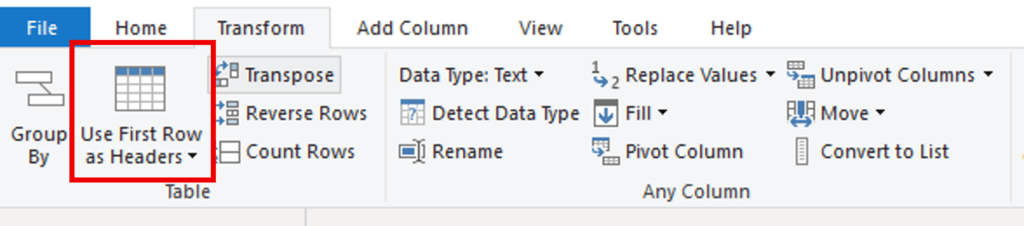
Next, set new column headers so its easier to see what data you have. To move the data from row 1 up to be the name of each column, click on the Transform tab and click Use First Rows as Headers – click on the icon of the table to make the change.
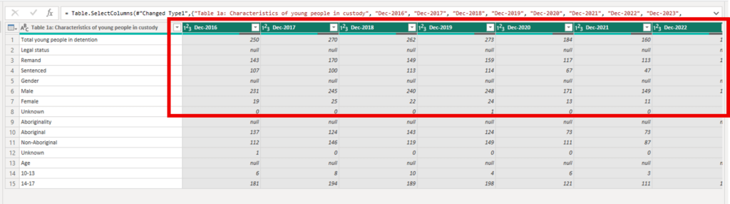
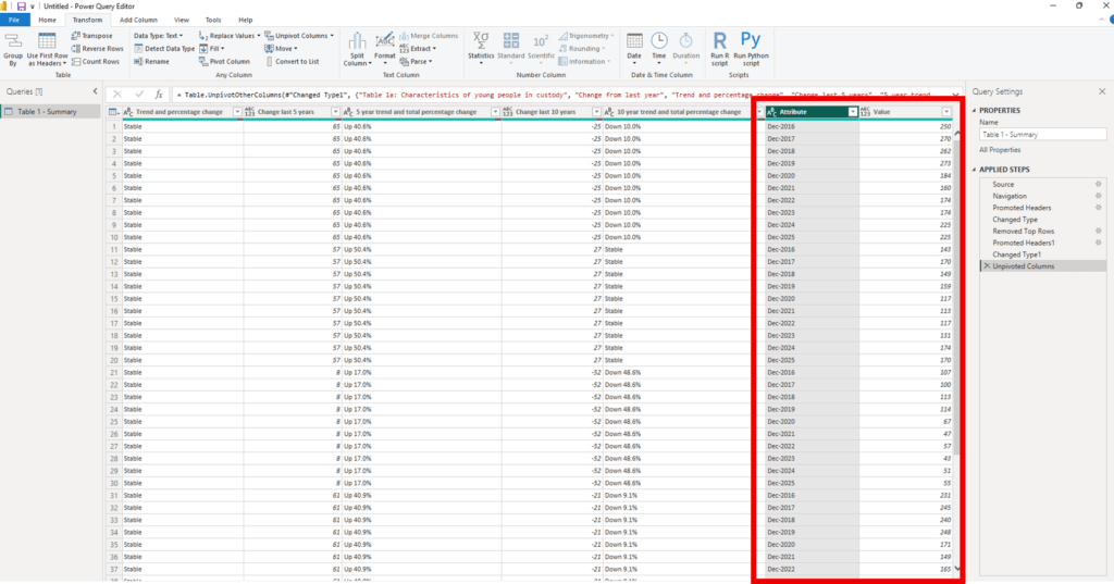
Next we want to transform the data into into long format. Long format uses fewer columns and more rows, and each row of the data represents a single observation (instance of the data). This format is easier for making charts. To do this, select all the date columns by holding Ctrl and clicking the tabs. All headers with the date in them should be green. Make sure you scroll across to get every one.
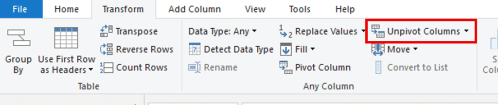
Then on the Transform tab, click Unpivot Columns (click the text, not the arrow next to it)
This will move all the dates to a new column called Attribute, and the values to a new column called Value.
Step 5 – Tidying
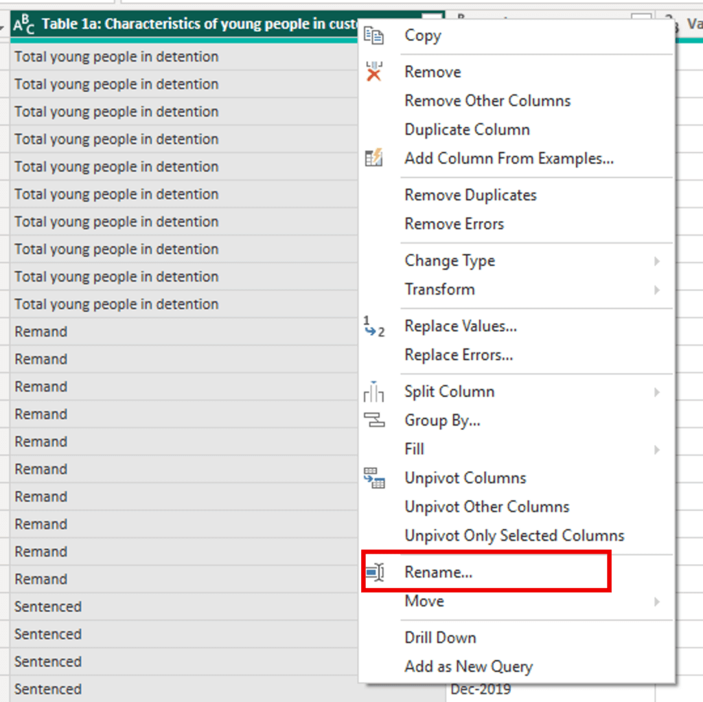
Double click the heading of Column 1 and rename it Characteristics. This can also be done by right clicking the column header and selecting Rename.
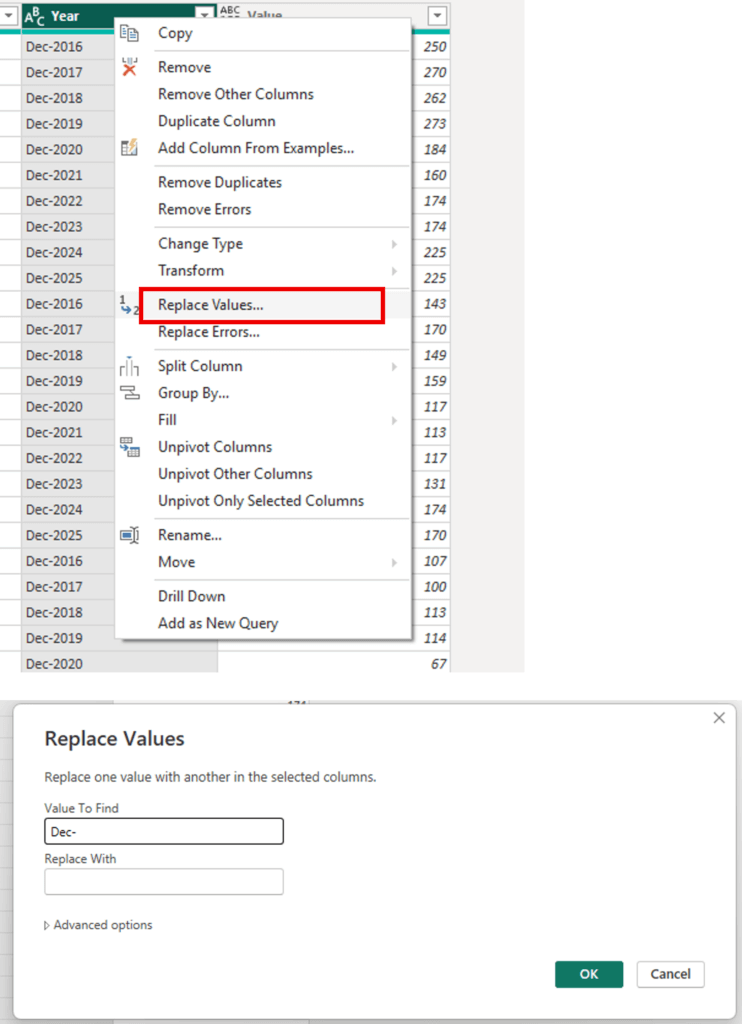
Rename the year column to ‘Year’ using the same process.
Then, remove the prefix “Dec -” before each year so that the years can be plotted on the horizontal axis of the chart. Right click the column heading and select Replace Values. Fill in the pop ups to replace ‘Dec-‘ with nothing, and hit OK.
Then, click the icon in the left side of the column heading, and select Whole Number. This will change the data type to a number which will make plotting easier.
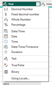
Follow the same process for the Value column to ensure it is also a whole number.
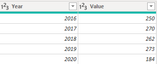
The final column headers should look like the below:
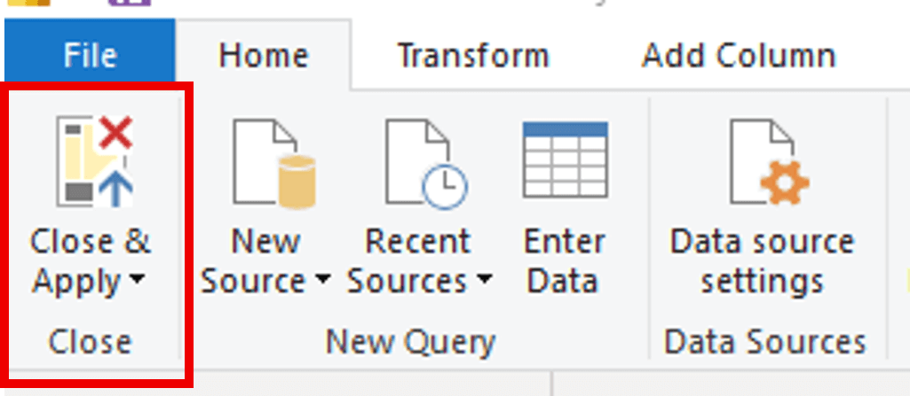
Once all changes have been made, return to the Home tab and select Close & Apply in the top left corner.
Building the Column Chart
Step 1 – Set up your chart
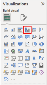
First, select the chart you wish to make. This example will use a clustered column chart.
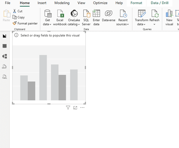
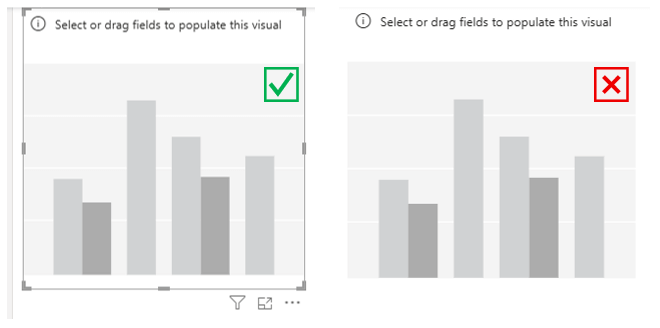
A blank box will appear in your workspace. You can use the markings around the chart area to stretch it larger, for better visibility when you add in the data.
Step 2 – Add your data
In the Data pane on the right-hand side, expand the dataset by pressing the > symbol
Ensure the chart area is selected, with the border around it.
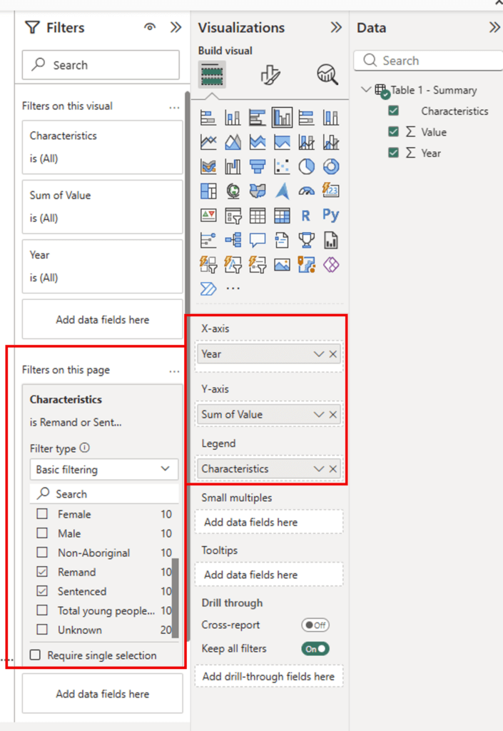
In the right-hand panes:
- Drag the Year line from the Data pane into the X-axis field in the Visualizations pane
- Drag the Value line from the Data pane into the Y-axis field in the Visualizations pane
- Drag the Characteristics line from the Data pane into the Legend field in the Visualizations pane
- Drag the Characteristics line from the Data pane into the Filters on this page field in the Filters pane. Then, check the box next to Remand and Sentenced (you can choose other characteristics if you want to measure different elements).
This will produce the following chart:
STEP 3 – Filtering your data
You can edit this basic chart using the Filter panel to show different results. For example:
- Check Male and Female to compare youth detention rates by gender
- Check Aboriginal and Non-Aboriginal to compare youth detention rates by Indigenous status
- Check 10-13 and 14-17 to compare youth detention rates by age
STEP 4 – Designing the Chart
Select the visual, and then select the Format visual icon in the Visualizations pane. If you do not see this icon, ensure the visual has been selected.
Expand the Y-axis menu, then expand the Title menu. Select the Title text box (it will say Auto by default) and add the appropriate copy (in this case, it will be ‘Number of Young People’).
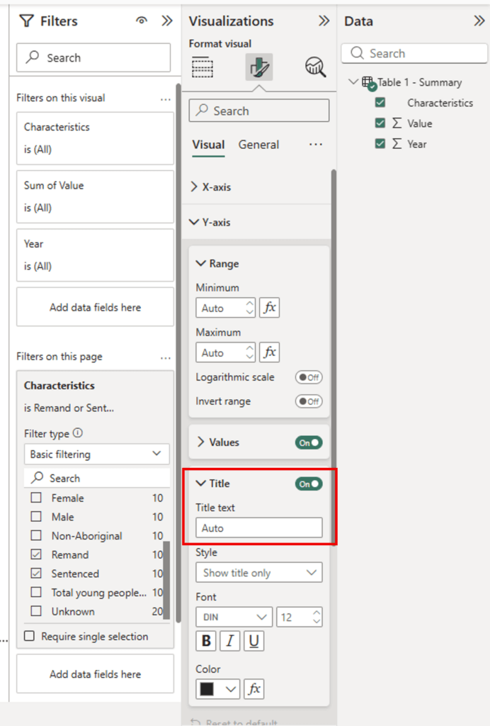
Repeat these steps under the Legend menu to make it more specific (e.g. Legal Status, Aboriginal Status, Gender). In this example, we will use ‘Legal Status.’

You also have the option to toggle off the title if you choose.
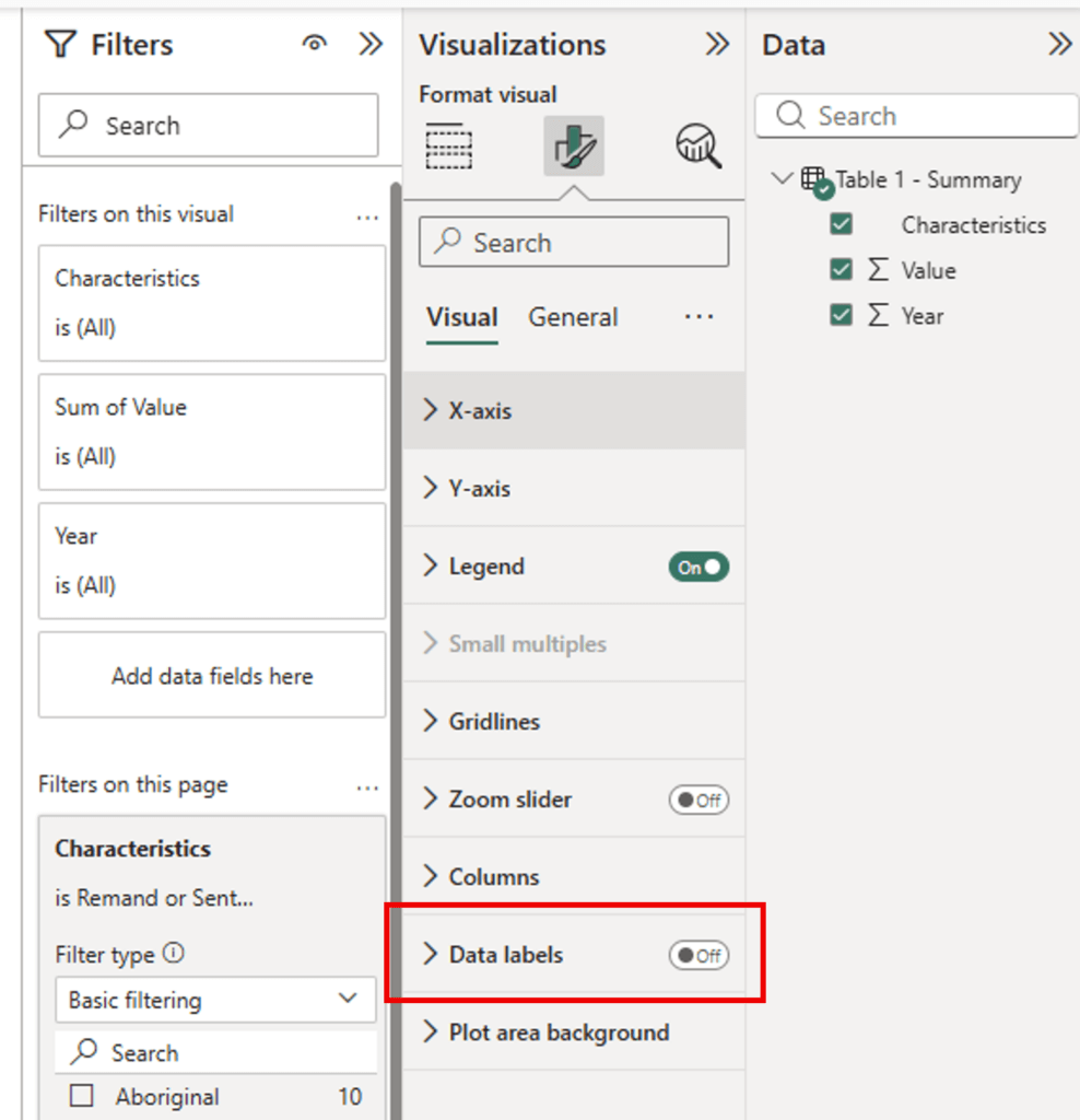
You can add data labels by toggling on Data Labels – this will add a number above each column, which can be customised using the options available when this menu is expanded (access this by clicking the > symbol).
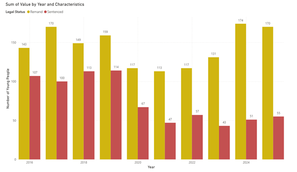
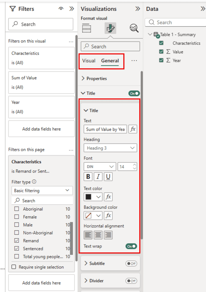
To change the heading, toggle to the General tab of this section, and open the Title menu. Change the title to ‘Incarcerated Youth in NSW by Legal Status’.
To change the colours used
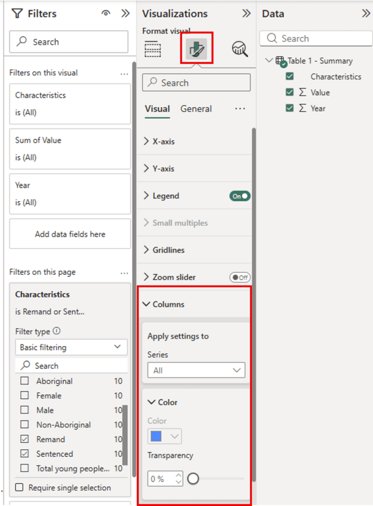
Click the chart you want to edit, then under the Format visual menu, click the Columns menu to expand it
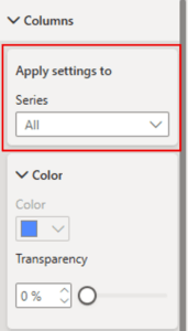
To change a specific colour, select one of the columns in the chart using the Apply settings to menu
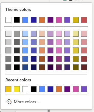
Select the series you want to change, then click the option under Color to show the options. You can choose from the existing colours or add your own using More colors…
Switch between the other series using the Apply settings to menu to change the other colours as needed.

Don’t forget to save your work, so you can revisit this chart and data as needed.